


Digital dashboards that help you identify deviations and make the right decisions.

Capture your deviations and turn them into improvements

Continuous improvement, Kaizen boards, PDCA and other tools.
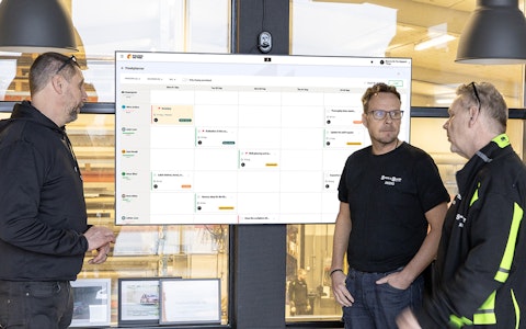
All your team’s tasks, neatly organized in one weekly view.
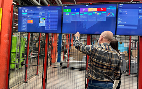
Improve key performance indicators within your specific focus areas with our SQCDP board.

Use the PDCA cycle as a tool to improve both quality and processes
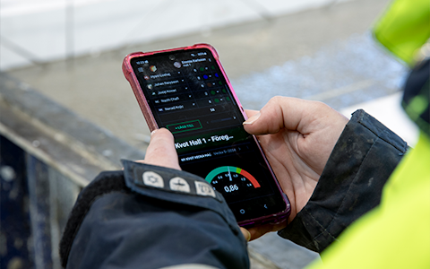
Digital tools for 5S work, recurring audits, and a well-organized workplace.
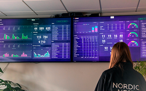
Visualize KPIs and communicate effectively throughout the entire organization.

Basic project management and activity boards.
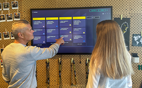
Kanban is a powerful method for visualizing, managing, and optimizing workflows.

Digital dashboards for takt time flow with takt time counter and stop time log.

Digital visitor registration provides full control over all planned and executed visits to your business.
A key part of daily management is tracking and visualizing the company's most business-critical KPIs. In Boards on Fire, there are several flexible ways to work with KPIs, with the Data Component serving as the foundation.
Using the Data Component, you can easily enter numerical values, display metrics such as on-time delivery or scrap rate using gauge charts, and monitor production performance over time with clear bar charts. It is a powerful tool for collecting, analyzing, and presenting data directly on your digital boards, creating insight and focus in your daily improvement work.
The Data Component requires a data source that stores information in the database. To create a new data source, go to the Data Sources tab.
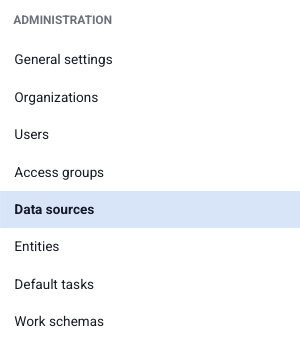
You will now see a list of all saved data sources. To create a new one, click the green "+ Add" button in the upper-right corner. This opens the settings menu for your new data source.

First, choose a name for your data source. The value entered in the Name field must follow these rules:
The name cannot be changed later, so choose it carefully.
You can then specify a Display Name for the data source. This is the name shown in lists of available data sources. Enter it in the Display Name field. The display name has no restrictions—you may use any characters you like. You can also enter a description of the data source in the field below the display name.
Next, select the precision for the data source. This determines the smallest possible time interval between data entries.
For example:
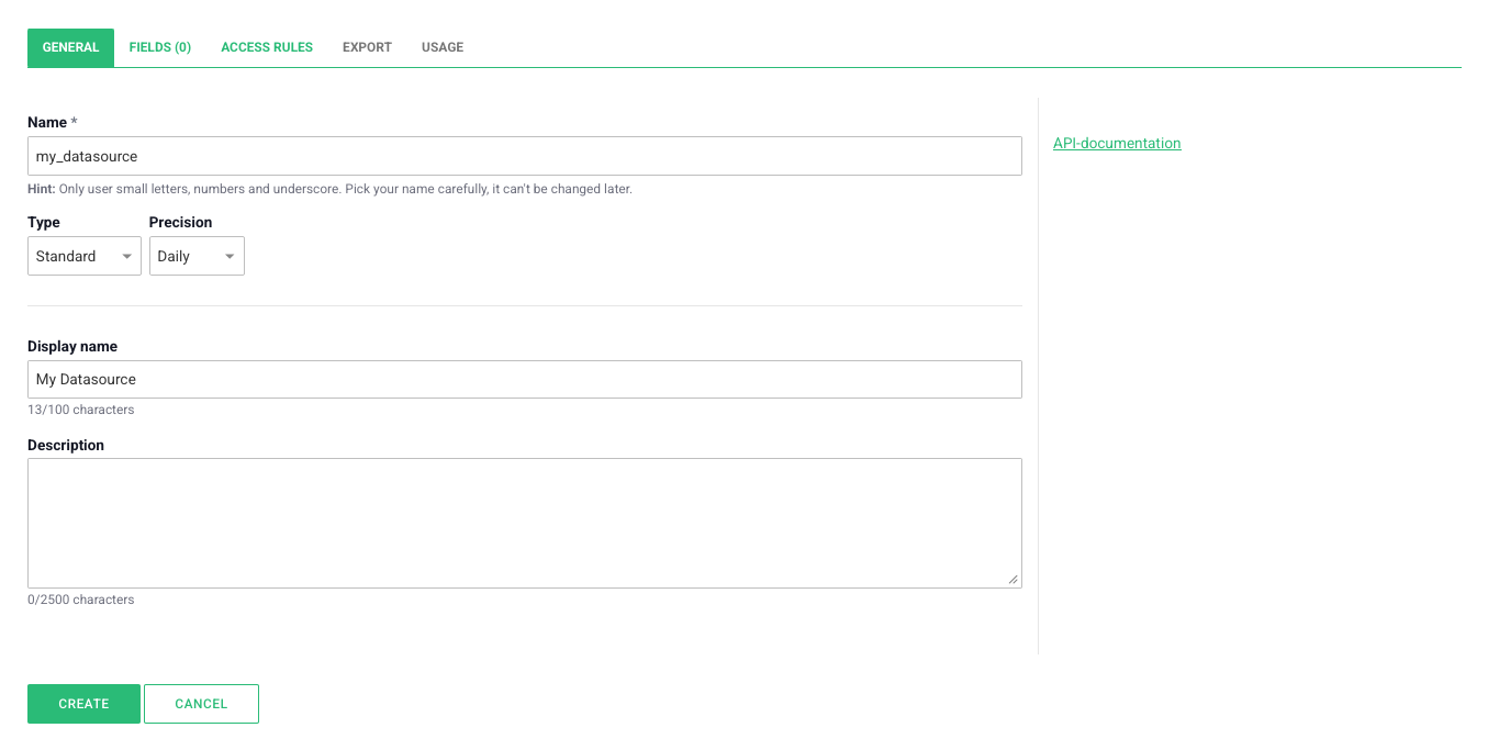
The next step is selecting the type of your data source. The selected type determines which field types can be used.
For example:
You can now add the fields that correspond to the data you want to enter in the components on your boards.
Go to the Fields tab in the data source settings.
Click the green Add Field button below the table.
For each field, specify:
The Key follows the same naming rules as the data source Name field.
The Display Name has no restrictions.
After naming the field, choose its Data Type from the dropdown menu.
Datatyperna som går att välja är följande:
When a value should remain the same over a long period—for example, a production target—you can use the Default Value function.
Click the three dots next to your number field and select Default Values. Here you'll find information about previously entered values.
Click Add Default Value. Then specify:
A maximum of one year can be configured at a time. If a unique group name is used, remember to include it.
Finally, enter the desired value. You can also replace previous values or leave the field empty to reset the value.
In addition to standard fields, you can also create Calculated Fields.
A calculated field automatically produces either a numeric value or a status color based on the values of other fields. First, specify the field key and display name. Then choose whether the calculation should return:
For status calculations, select one field representing the actual value and another representing the target value. The comparison determines the resulting status, which can then be displayed in, for example, a Status Component.
The Usage tab provides an overview of where and how extensively the data source is being used.
The data component is the most commonly used component for managing numerical data (values).
In the component’s settings, there are six tabs:
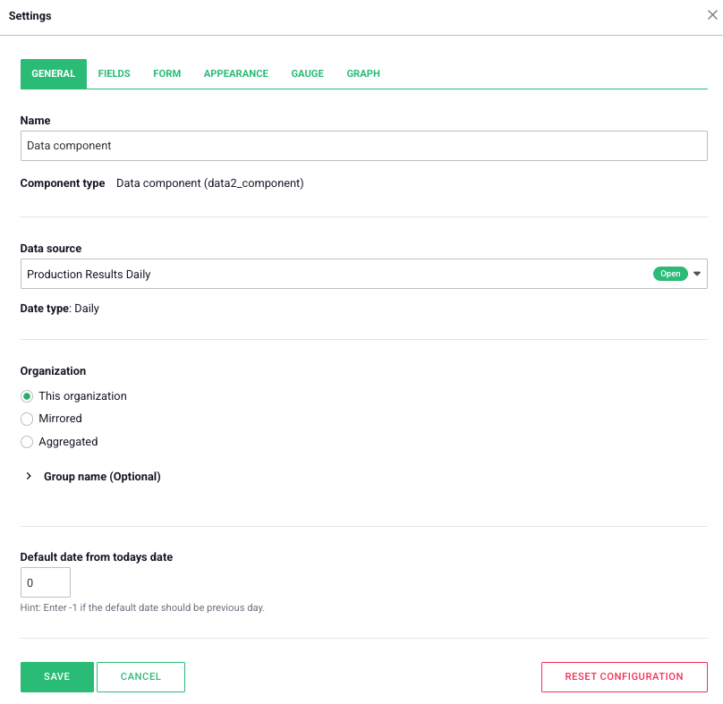
Under the “General” tab, you will find the basic settings for the data component:
-If two identical components exist in the same organization, they will display the same data.
-If one or both components have a unique group name, the data can be separated, allowing the fields to show different values despite sharing the same data source.
-To aggregate or mirror data from a component with a group name, the linked component must have the exact same group name.
This Organization: Displays only the data entered within the organization where the component is placed.
Mirrored: Displays data from another organization. You can select the organization via a drop-down menu. (When mirroring, you can also input data as if it were entered in the mirrored organization).
Aggregated: Displays data from multiple organizations. Select which organizations’ data to display from the list.
Example: If you enter -3 and today’s date is May 20th, the component will display data from May 17th instead.
These settings make it easy to customize how and where data is retrieved, displayed, and shared between different organizations.
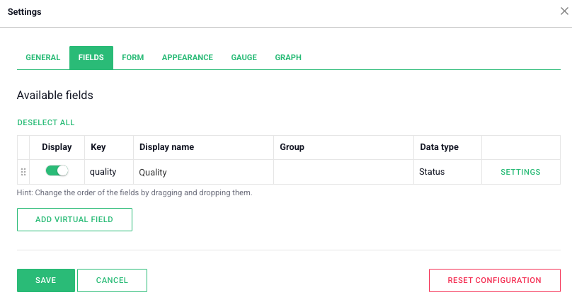
Here, the fields from the selected data source are displayed, and you can adjust their settings to customize how they are used:
-This is not the same as the group name under the “General” tab. These are entirely separate functions. To group fields, enter a group name in the box. Fields with the exact same group name belong to the same group.
-Grouping only affects how fields are displayed and is purely a visual feature.
-These settings make it easy to customize field visibility and structure, helping you create clear and functional forms or graphs.
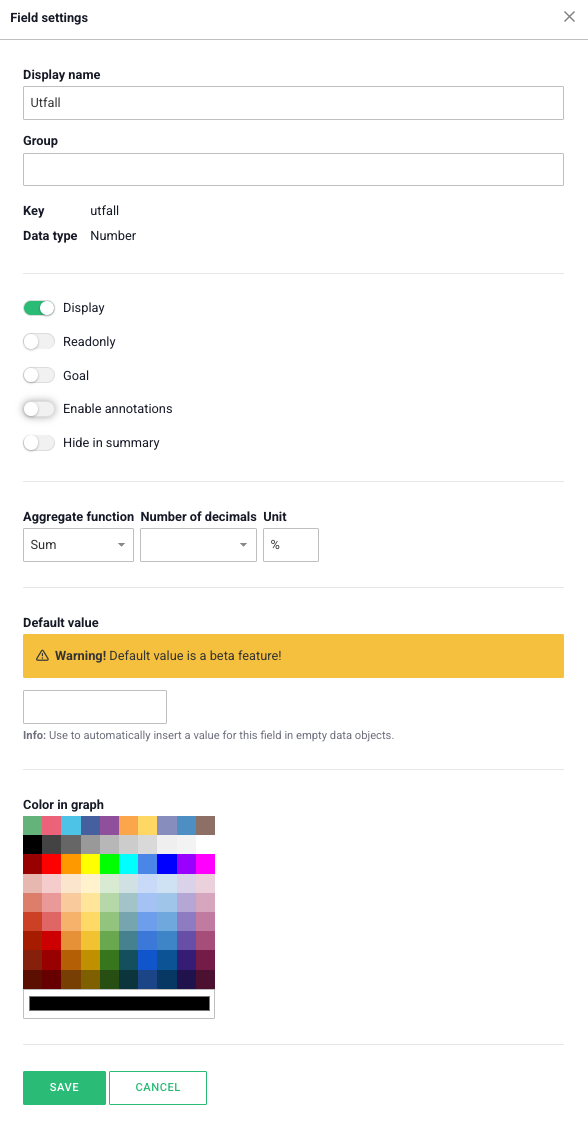
The top three headings, “Display Name,” “Group,” and “Display,” correspond to the same settings available in the previous view.
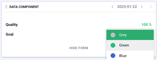
-Sum: Combines all values from the organizations.
-Average: Displays the average value across all organizations.
-Max: Displays the highest value.
-Min: Displays the lowest value.
This setting also affects how the field is displayed in graphs or speedometers when grouping data. In these cases, the aggregation is applied to data from multiple days or weeks instead of organizations.
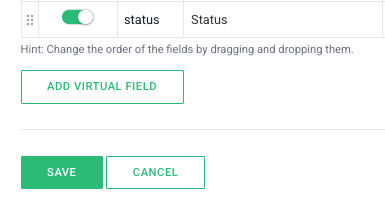
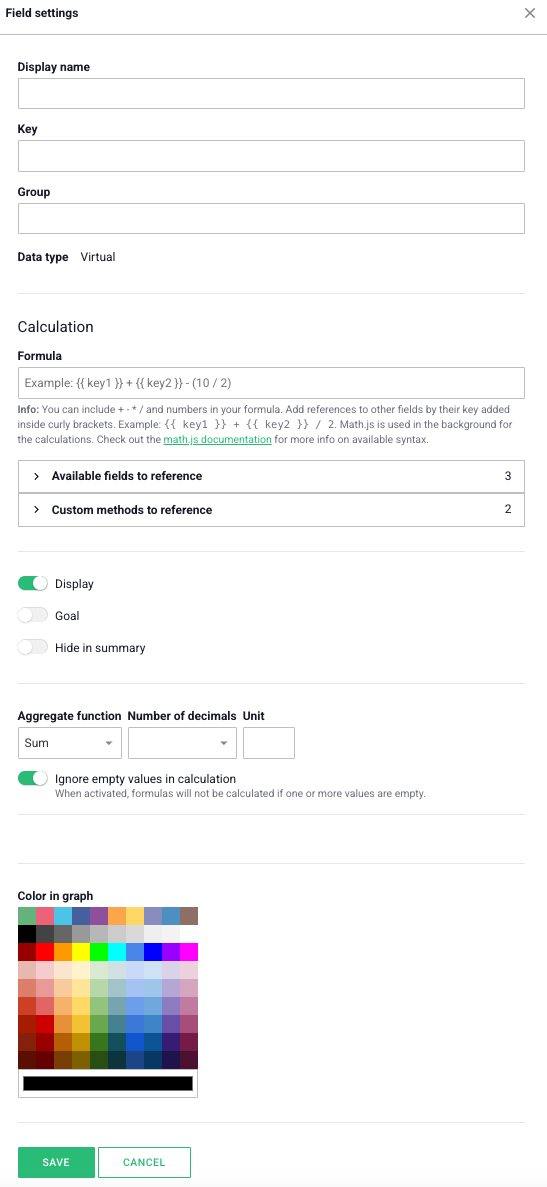
For the settings that also apply to a regular field, the same rules and information apply.
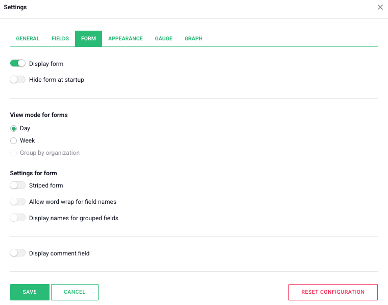
The form is used to input values for a field, and the menu contains the settings for the form in the data component.
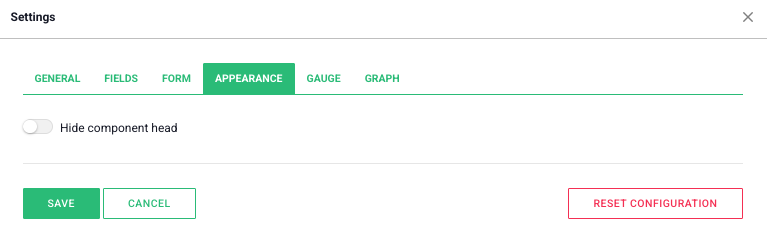
Here, you can choose whether to display the component header, which includes the component’s name and date navigation. If you choose to hide it, the header will only appear when the user hovers over the top part of the component.
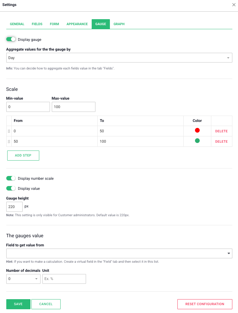
The gauge is, alongside the form, one of two ways to visualize data in the data component.
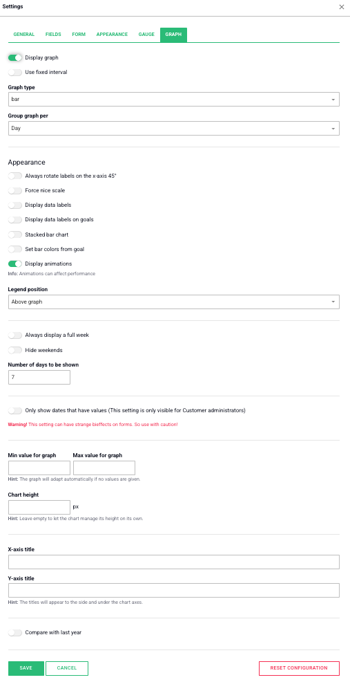
Graph
The graph is the second way to visualize data in the data component.
Free web demo


