


Digital dashboards that help you identify deviations and make the right decisions.

Continuous improvement, Kaizen boards, PDCA and other tools.

Capture your deviations and turn them into improvements

Real-time control for takt-based production. Detect disruptions as they happen, respond faster, and keep production on pace.

Integrate Boards on Fire with ERP, MES, OEE, Power BI and other systems. Automate data flows, reduce administration and act faster.
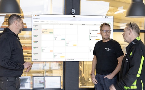
All your team’s tasks, neatly organized in one weekly view.
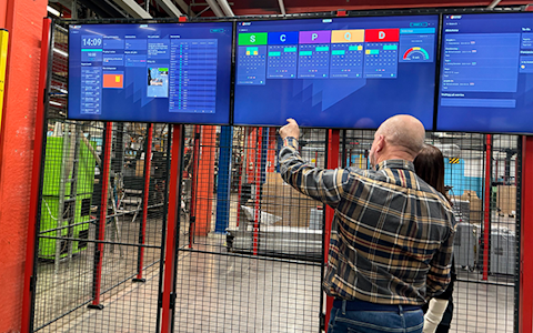
Improve key performance indicators within your specific focus areas with our SQCDP board.

Use the PDCA cycle as a tool to improve both quality and processes
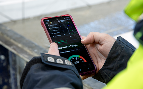
Digital tools for 5S work, recurring audits, and a well-organized workplace.

Basic project management and activity boards.
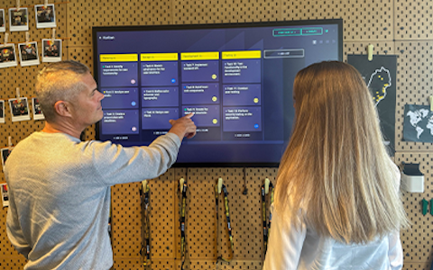
Kanban is a powerful method for visualizing, managing, and optimizing workflows.
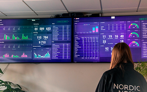
Visualize KPIs and communicate effectively throughout the entire organization.

Digital visitor registration provides full control over all planned and executed visits to your business.
The visualization component allows you to display your data in several new ways. With this component, you can visualize your deviations, improvements, KPIs, and projects exactly the way you need to see them. This guide will help you set up and customize the component according to your preferences.
When a visualization component is added to a board, you first select the type of visualization you want to create.
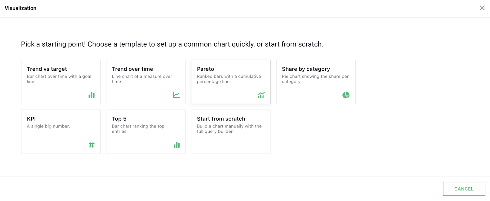
The different options configure the component in different ways and have different requirements regarding the content of the data you want to use.
This configuration allows you to visualize your data as a bar chart with a target line over time. It can only be used with data sources. For this configuration to be available, the data source must contain a field with a defined target. During the initial setup step, you select which field should be displayed.
This configuration displays your data as a line chart over time. Unlike Trend Against Target, no target line is displayed. This configuration can be used with all types of data, such as data sources, entities, and deviations. In the first step, you select the source, followed by the field you want to measure. When using a data source, you can only use numerical values. When using, for example, an entity, you can also measure the number of rows per date interval.
The Pareto configuration creates a Pareto chart for a date range and can be used with all data types. It is particularly useful when visualizing entity-based data, such as entities, deviations, and continuous improvements. For example, you can visualize data broken down by deviation category or severity. When using data sources, you can also display data broken down by organization or date interval. During the first setup step, you select the source and field to be displayed, and then specify how the data should be ranked.
This configuration is similar to Pareto, but instead of displaying the data as bars with cumulative values, it is represented as a pie chart. With this configuration, you can, for example, visualize the distribution of deviations by category or production outcomes by department. During setup, you select the source and metric, as well as how the data should be divided in the pie chart. This configuration can be used with all data types.
This is the simplest configuration and displays only a single large number. During setup, you select the source and value to be displayed.
This configuration is very similar to Pareto and works in much the same way. The difference is that it does not include the cumulative value line and only displays the five largest values instead of all values. Otherwise, the setup and usage are the same.
If this option is selected, you will go directly to the component settings, where you can configure the component as you wish.
Under the General tab, you can choose the name of the component, whether the component header should be displayed, and whether the field name should be displayed as a label in the chart. You can also select a default date for the component here.
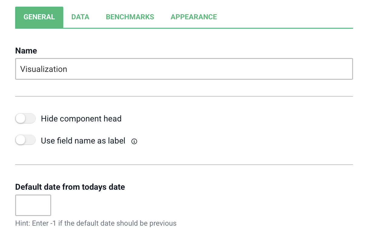
Under the Data tab, you configure how your data should be visualized in the component. The tab consists of several different sections.
In this section, you select which source should be used, such as deviations, entities, data sources, or continuous improvements. You can choose to display multiple sources if you want; the data will then be combined. If you have used one of the configurations described above, this section will be automatically populated based on the selections made in the first step.
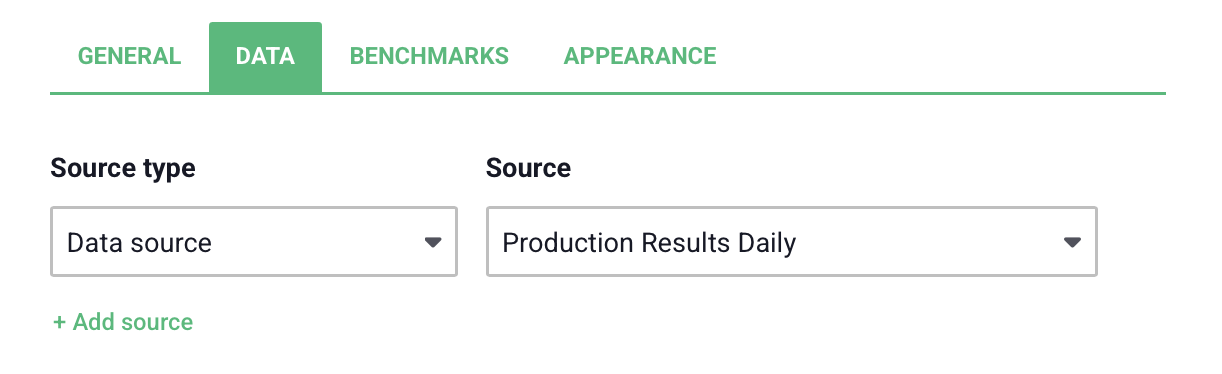
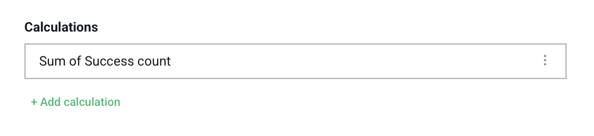
Here, you select which data within the source should be displayed. This could, for example, be the sum of values for a field in a data source or the number of rows in an entity. Depending on which source you have selected, you will be presented with different options. You can select multiple calculations to display several different fields or KPIs in the chart. This section may also be automatically populated from previous steps, depending on which configuration was used.
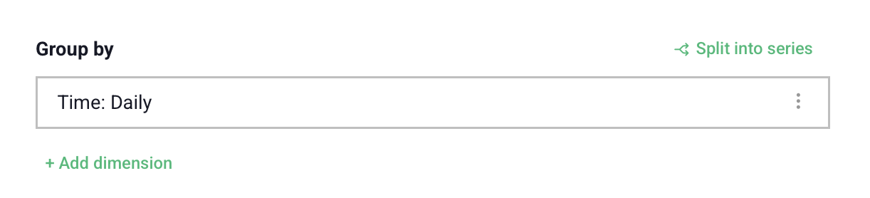
If you want the data to be separated based on, for example, category, date, or organization, this is where you configure it. You can group the data by multiple dimensions to break it down further. Some types of visualizations require the data to have been grouped one or more times.
If the data has been grouped at least once, the grouping can be divided into a series. This means that each group in the grouping is divided according to the selection made for the series split. Some types of visualizations require the data to have been divided into series.
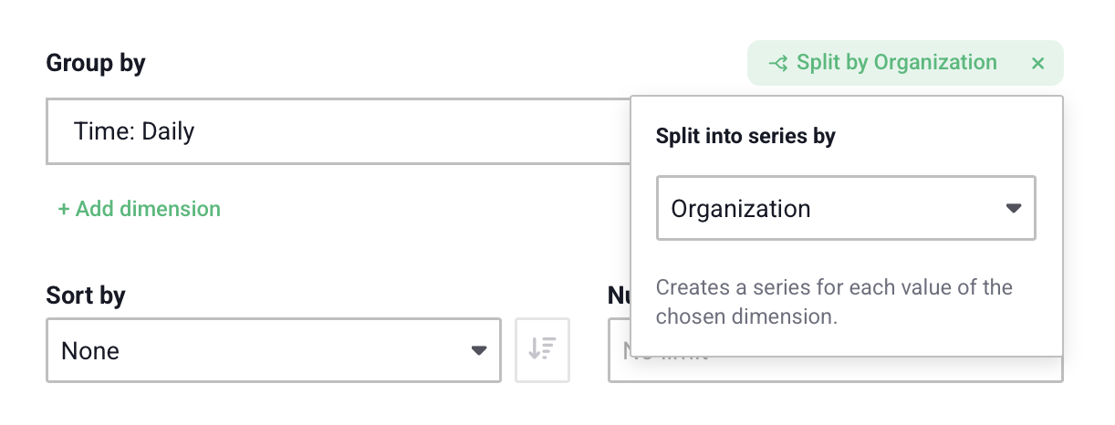
The available options for grouping the data or dividing it into series depend on the source you are using and its contents.
If you have chosen to group your data, you can choose how it should be sorted. This can be based on, for example, date or value, depending on the contents of your source. You can also choose the maximum number of data points to be displayed in the visualization.

Here, you can filter which data you want to display in the component. How the data can be filtered depends on the selected source and its contents, but there are some common options.
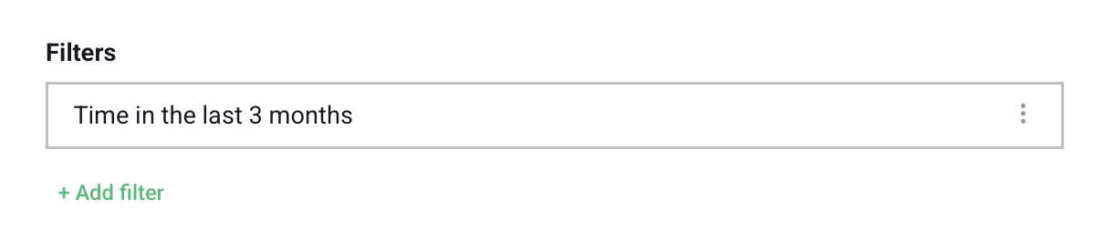
For other fields, filtering may work slightly differently. For example, for numerical fields, you can choose to display only values above a selected value. For an entity, you can choose to display only rows where a specific user is selected in a user field.
You can filter by multiple dimensions simultaneously to display exactly the data that is relevant to the component.
On the right side of the component, you can see a preview of what the visualization will look like. The preview changes based on the settings you select and is updated automatically. If there is currently no data in the source you intend to use, you can enable sample data in the top-right corner. Random values will then be displayed.
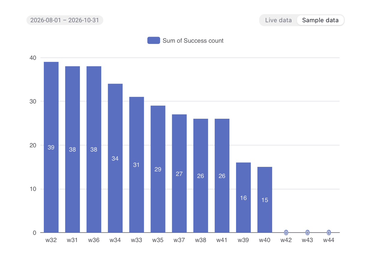
Below the preview, you select the type of visualization you want to use. Some visualizations require, for example, a grouping or series to be present before the data can be visualized. If an option is unavailable, you can see which requirements have not been met by hovering your mouse over the option.

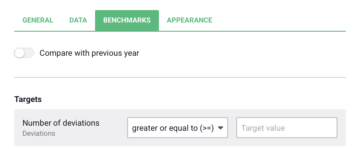
Under the Benchmarks tab, you can choose to compare your data with data from the previous year, which will then be displayed in the chart. For this option to be available, the data must have been filtered by time.
You can also choose to show or hide target values if such values already exist in your source. If target values do not exist, you can add them here.
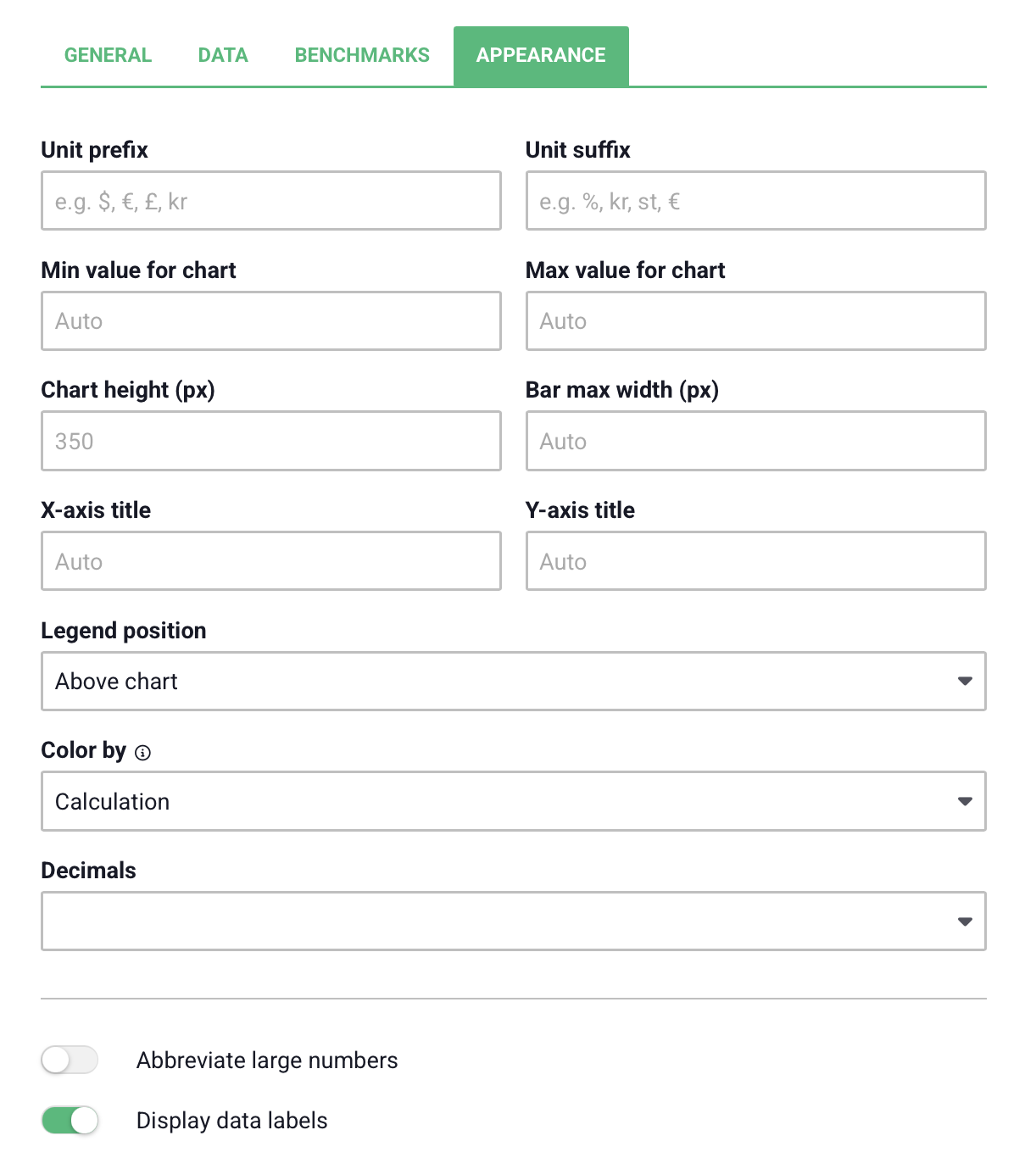
Under this tab, you can customize the appearance of the visualization, for example by adding a prefix or suffix. You can also adjust the height of the component by entering a value under "Chart Height". As with the Data tab, you can see these adjustments in the preview on the right.
When you have finished making your selections, click Save in the bottom-right corner of the settings.
Free web demo