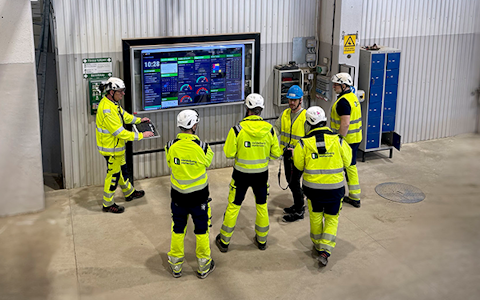
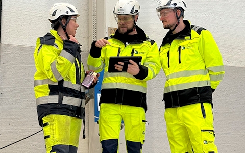
Digital dashboards that help you identify deviations and make the right decisions.

Capture your deviations and turn them into improvements
Continuous improvement, Kaizen boards, PDCA and other tools.
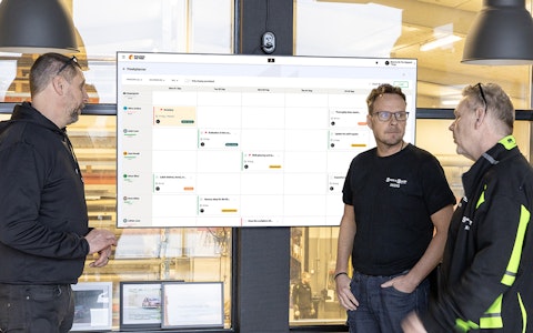
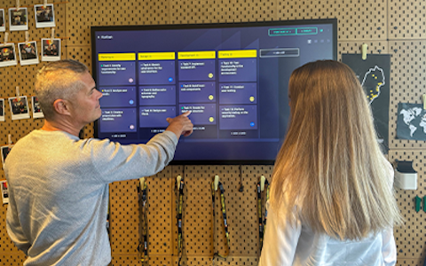
All your team’s tasks, neatly organized in one weekly view.
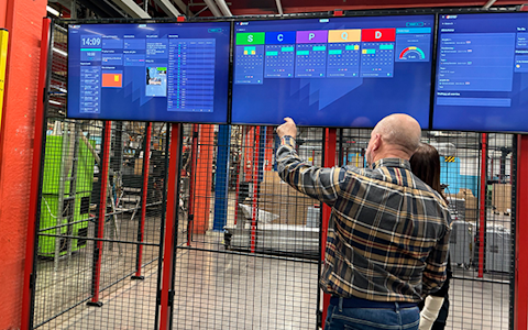
Improve key performance indicators within your specific focus areas with our SQCDP board.

Use the PDCA cycle as a tool to improve both quality and processes
Digital tools for 5S work, recurring audits, and a well-organized workplace.
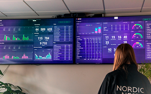
Visualize KPIs and communicate effectively throughout the entire organization.

Basic project management and activity boards.
Kanban is a powerful method for visualizing, managing, and optimizing workflows.

Digital dashboards for takt time flow with takt time counter and stop time log.
Digital visitor registration provides full control over all planned and executed visits to your business.
In Boards on Fire's dashboards, there are different components that fulfill different functions. In this chapter, we will explain how the most common ones work and are set up. You add a component to your board by clicking on "Add" in the upper right corner and then selecting the component type.
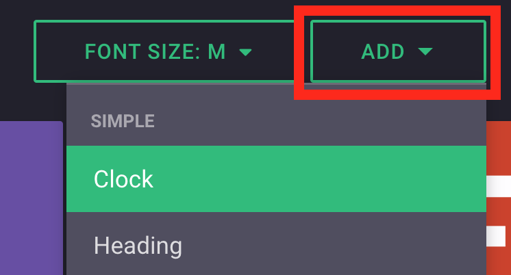
The components that will be explained are as follows:
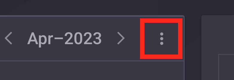
All components can be tuned and set up in different ways depending on the function that each component fulfills. You reach the settings by clicking on the three dots in the upper right corner of the component.
The to-do list is used to list tasks that must be done within an organization. You use it by clicking on "+ Add" and then filling in the form. Important to keep in mind when using the To Do list, is that the data cannot be aggregated/mirrored between organizations.
The image carousel is used to display images in a board, but unlike the regular image component (described below) this one can display several images in rotation. Put some images under the component's settings and set how long you want it to display each image.
The image component is used to display an image in your board. You add the image under the component's settings
"Text“ is used to have somewhere to write on the board. Here you can write whatever you want. Keep in mind, however, that unlike the “Shared text” - component this one cannot be aggregated nor mirrored.
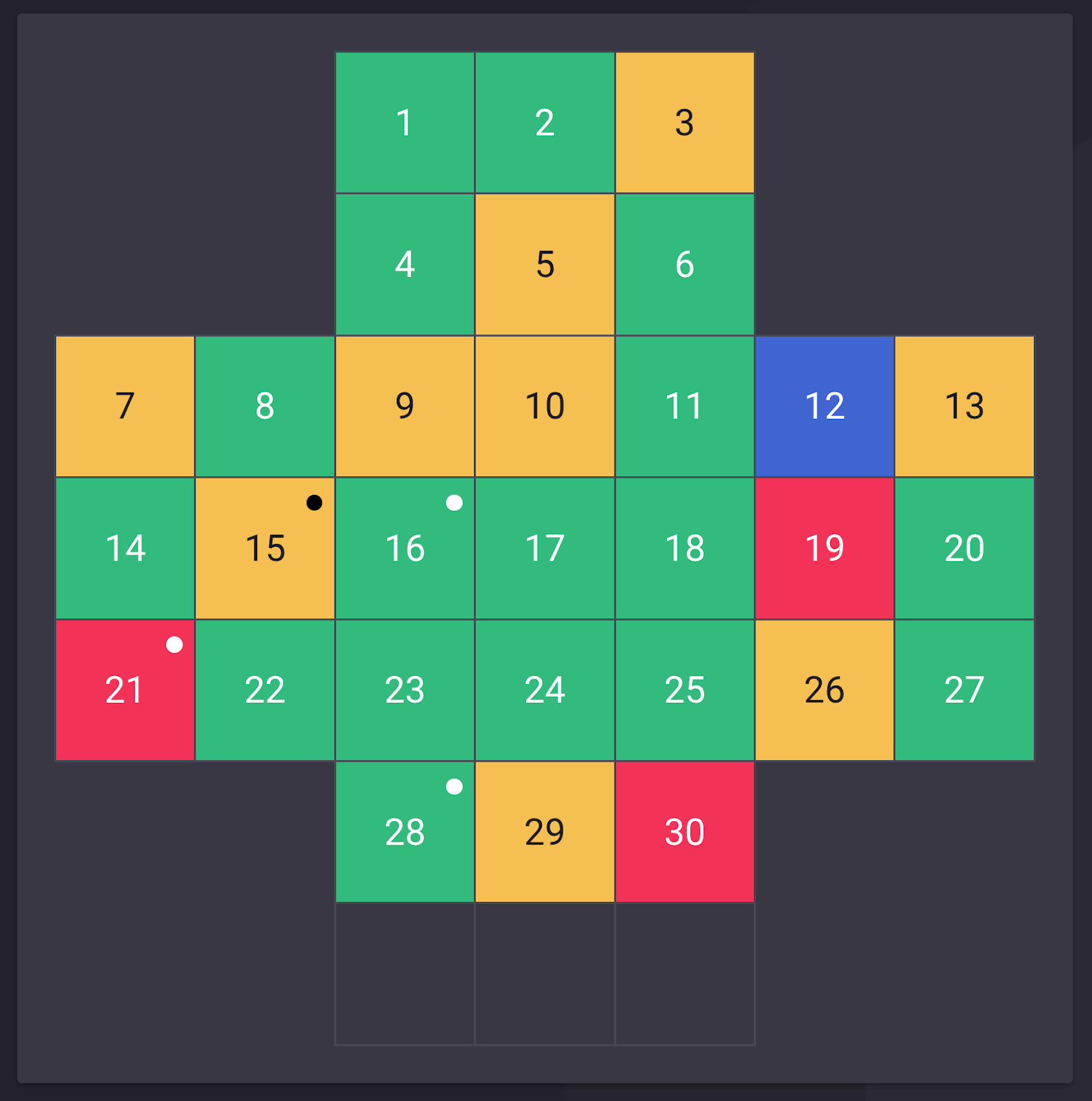
The safety cross is used to visualize accidents and incidents in the organization. This component can be aggregated or mirrored, depending on what you choose in the settings. If two aggregated boards are merged into eg a leadership board, it will always be the "worst" status that is shown in the leadership board's Safety Cross. Thus, the leaderboard will light up red for an accident, even if it is only one sub-organization that has had an accident during the day. The safety cross is also available in a format that shows the whole year divided week by week.
The clock shows the same time as the system, and is not locked to a specific time zone
In the header component, you can choose the background color as well as the text color under the component's settings.
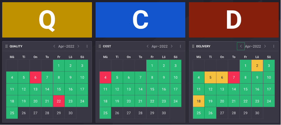
The status component has the same functionality as the safety cross and can, for example, be used to log deviations in other areas such as quality, delivery, production, etc.
The Continuous Improvements component is used to visualize which improvements are taking place at a workplace. Under the component's settings, you can choose which improvement stages you want to display. If you select “active”, all but the completed improvements will be displayed. Under "Organization settings", you can choose which organizations' improvements you want to show. Under the "Filter" tab, you can choose to only show improvements that have a certain label. These labels can only be created when you make a new improvement, so it is not possible to create new labels under the component's settings. The component is only available to those who use Boards on Fire's improvement module.
The time for the timer can be set by entering the numbers in the component.
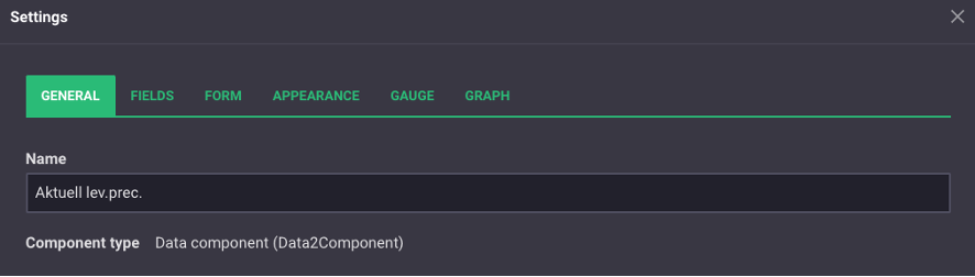
The data component is used to fill in and visualize data from a data source. Under the "Fields" tab, you can choose which fields should be displayed in the component's form/graph, as well as which color they should have in the graph. Under the "Form" tab, you can choose to display the form connected to the data source. This is where you fill in the data that is stored and visualized in components connected to the same data source.
Shared Text is similar to “Text” in the sense that it is a place to write on a board. The difference is that the shared Text is linked to an entity, and can therefore be aggregated/mirrored. Unlike other components, however, you cannot choose which organizations the component should aggregate/reflect. It is something that is controlled by which entity you use. If the same entity is used in two different places, they will display the same text.
The entity component is used to fill in and visualize data from an entity. This can be, for example, projects or deviations. Under the "General" tab, you can choose whether the data should be displayed in table or list format. Under the same tab, you can choose how the data should be aggregated/mirrored. Under the "Fields" tab, you can choose which fields you want to display in the table/list. Under the "Filter" tab, you can choose to only display a line in the component if it meets certain requirements for the various fields.
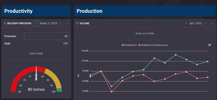
Simple number visualizer is used to visualize data from a field in a data source. Under the "General" tab, you choose which data source to use, and under the "Field" tab, you choose which field to display.
Resource planning is used to set up tables with data. Only data from data sources can be used in this component. Under the tab "Field" you can choose which fields you want to display, and under the appearance tab you can choose whether you want to see a day's or a week's data.
The Number visualizer is similar to Simple number visualizer in that it is used to visualize data from a data source. The difference is that you can display data from several fields, but also from several different data sources. To display a field's data, click on "Add" under the general tab in the component's settings. You then choose the type of data you want to display, as well as from which data source. Under the field tab, you can then choose which field's data you want to display.
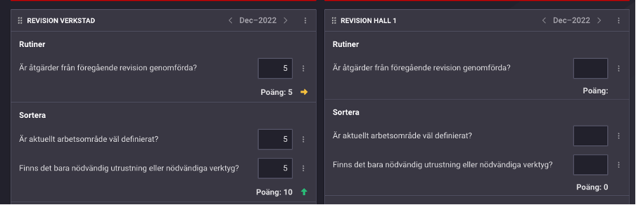
Recurring checklist is mainly used to create different types of checklists, for example within 5S work. It can be checklists/questionnaires/audits etc. which are carried out daily, weekly or monthly. The component is connected to a data source, which must contain the same number of fields as you want questions/items in the list. These fields must also be of type number. Under the tab "Field" you can name your questions/points, if you haven't already done so in the data source, here you can also give each question a min/max value. Under the Gauge & graphs tabs you can have Gauges and graphs linked to the number of points given per question/point.
Free web demo