
Digital dashboards that help you identify deviations and make the right decisions.

Capture your deviations and turn them into improvements

Continuous improvement, Kaizen boards, PDCA and other tools.
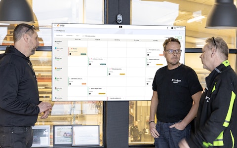
All your team’s tasks, neatly organized in one weekly view.
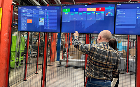
Improve key performance indicators within your specific focus areas with our SQCDP board.

Use the PDCA cycle as a tool to improve both quality and processes
Digital tools for 5S work, recurring audits, and a well-organized workplace.
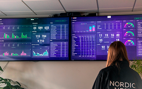
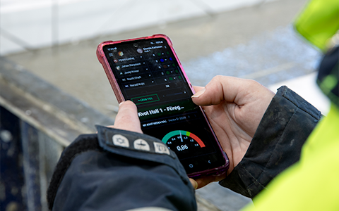
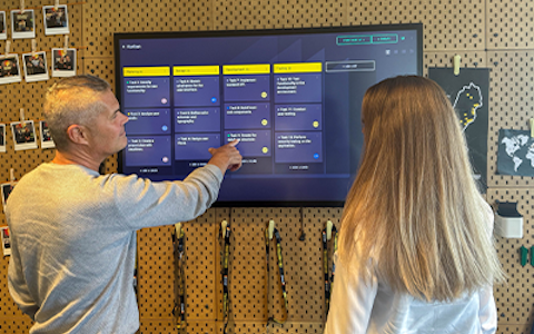
Visualize KPIs and communicate effectively throughout the entire organization.

Basic project management and activity boards.
Kanban is a powerful method for visualizing, managing, and optimizing workflows.

Digital dashboards for takt time flow with takt time counter and stop time log.

Digital visitor registration provides full control over all planned and executed visits to your business.
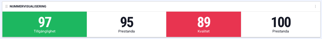
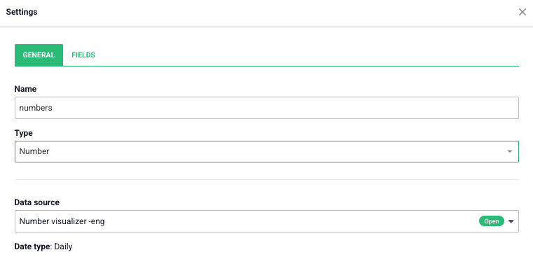
In the number visualization component, you can display multiple key figures simultaneously. The component’s settings are divided into two tabs.
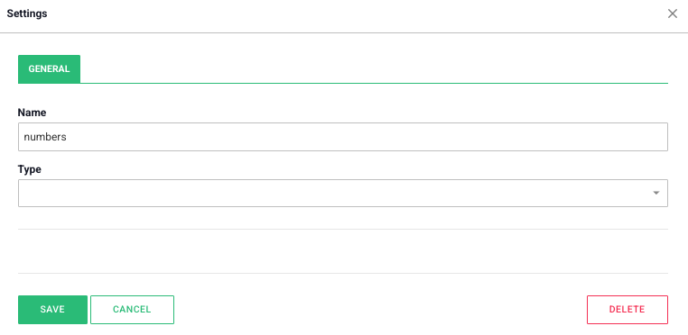
Under this tab, you will find the “general settings” for the component.
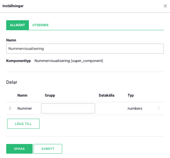
The number visualization consists of several sections, where each section corresponds to a row in the component. Each section can be linked to its own data source.
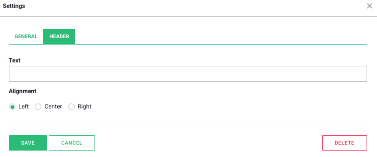
If you select the “Header” option, a new tab named “Header” will appear in the settings (see the image below). In the “Text” field, you specify the content of the header, and under “Alignment” you choose its position.
You will also see a new tab in the settings, “Fields”. Here, you can configure how the data will be visualized in the component. Information about the settings in the “Fields” tab can be found in the section on the data component and is also applicable here.
In the “Field” section, you specify which field from the data source will be affected by the buttons. Under “Label”, you can give the buttons a name. In the “Value” tab, you choose how much the value should increase or decrease with each button press.
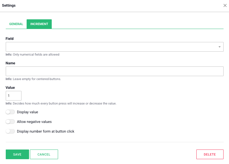
If you check the “Allow negative values” box, the value in the field can be lowered below zero. If you instead select “Show number form upon button press”, a form will appear when a user clicks one of the buttons.
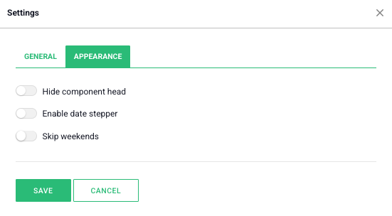
Show date navigator: If you enable this setting, the user can navigate forward and backward in time using a date navigator at the top of the component.
Hide component header: If you enable this option, the component’s name and date navigator will be hidden until a user hovers over the top area of the component with the cursor.
Free web demo