In-depth guide of the data-related components in Boards on Fire
This is an in-depth guide to the setup and usage of the components data component, number visualization, and simple number visualization.
To use these components, you need to create a data source. You can read more about how to do that here.
Data Component
The data component is the most common component when it comes to handling data in the form of numbers (values). Within the settings of the component, there are six tabs.
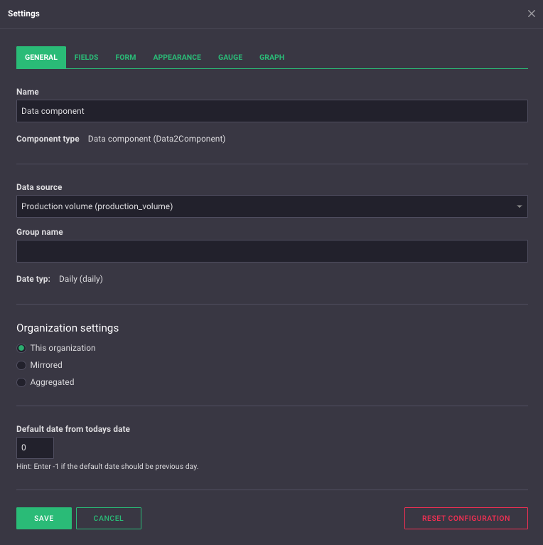
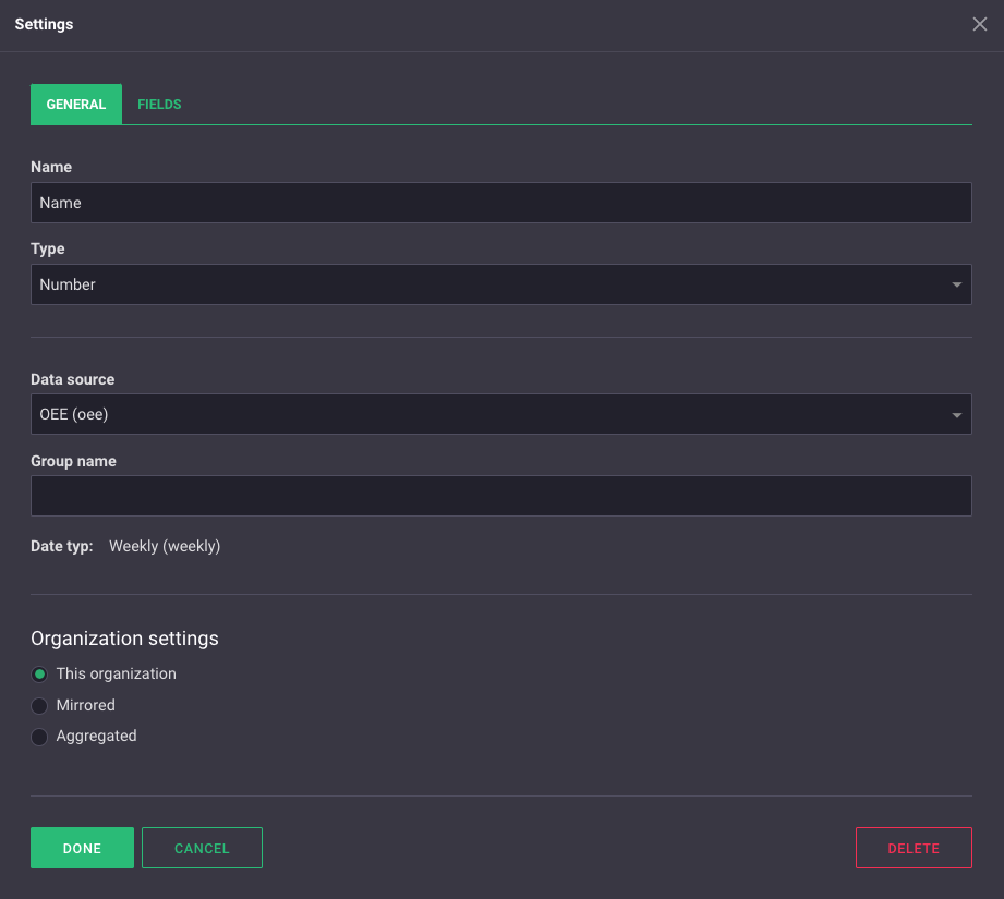
General
Here you'll find the "general settings" for the data component.
- In the "Name" field, you can choose what should appear at the top of the component when you're in the overview view.
- In the "Data Source" field, you select which data source you want to connect your component to. Here, all the data sources you have created are visible.
- In the "Group Name" field, you can choose a group name for the component. A group name acts as a kind of filter. If two identically adjusted components exist within the same organization, they will display exactly the same data. If one or both of the components have a group name that is unique to the component, the data can be separated. The fields in the components can then have different values, even though they belong to the same data source. If you want to aggregate/mirror data that has been input into a component with a group name, the component you're aggregating/mirroring to must also have the exact same group name.
- Under "Organization Settings", there are three options: "This organization," "Mirrored," "Aggregated." Here you can choose which organization's data you want to display. If you choose "This organization," only data entered into the same organization as the component will be shown. If you choose "Mirrored," you can display data entered into another organization. You select which organization's data you want to display in the drop-down menu. If you're mirroring another organization, you can also enter data as if it's being entered into the mirrored organization. If you choose "Aggregated," you can display data from multiple organizations in your data component. You check the box for which organization's data you want to display.
- In the "Default date from today's date" field, you can "go back" a chosen number of days for the component. With a setting of -3, the component on the 20th of May would instead show data from the 17th of May.
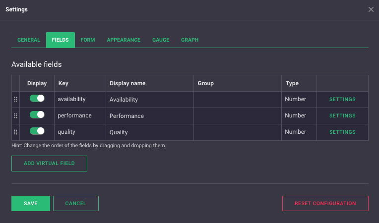
Fields
Here you can see which fields are available in the selected data source and adjust their settings.
-
Under "Display," you can check/uncheck which fields should be visible in the form/graph.
-
Under "Key," you can see the field's key. This can only be adjusted from the data source settings.
-
Under "Display Name," you can choose what name the field should have in the form/graph.
-
Under "Group," you can group your fields. This should not be confused with the group name under the "General" tab; they are completely separate things. To group your fields, enter a group name in the box. Fields with the exact same group name belong to the same group. Field grouping is purely visual.


On the left, an ungrouped form; on the right, a grouped form.
- Under "Type," you can see the data type of the field. This can only be adjusted from the data source settings.
If you click on "settings" to the right, a box with settings for the individual field will appear.
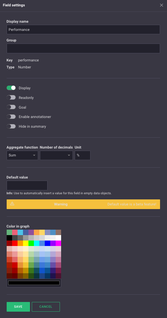
The top two boxes, "Display Name" and "Group," along with the "Show" button, are the same settings that you can configure from the previous view.
- If you check "Readonly," it will not be possible to edit the field's value in a form.
- If you check "Goal," the field will be displayed as a "goal line" in a bar chart. If the field is marked as a "Goal," the option "Set bar colors from goal" under the "Graph" tab will be based on this field.
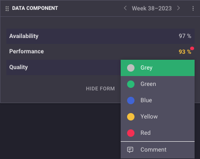
- If you check "Enable annotations" and double-click on a field in a form, a menu will appear where you can set a color and comment on a value (see image below).
- If you check "Hide in summary," the field will not be visible in the summary of a form.
- In the "Aggregation function" field, you can choose how the field should be displayed if the component aggregates data from multiple organizations. If you choose "sum," all the values from different organizations will be added together. If you choose "mean," the average value of all organizations' data will be displayed. If you choose "Max," the highest value will be displayed. If you choose "Min," the lowest value will be displayed. These settings also affect how the field is displayed in a graph/gauge if you group them. In that case, the setting serves the same purpose, but instead of multiple organizations' values, it considers values from multiple days/weeks.
- In the "Number of decimals" field, you can choose how many decimal places should be displayed in the form/graph.
- In the "Unit" field, you can choose what unit the field should have in the form/graph.
- In the "Default value" field, you can set a value that the field should have automatically. Keep in mind that this value won't be aggregated, but will only be visible in the current component.
- In "Color in graph," you can choose the color that the field should have in a graph.
If you click on "Add virtual field," you will access settings for a new virtual field (see image below). A virtual field is a calculation based on one or multiple other fields and therefore cannot be aggregated or mirrored. It's also not possible to manually input a value for a virtual field.
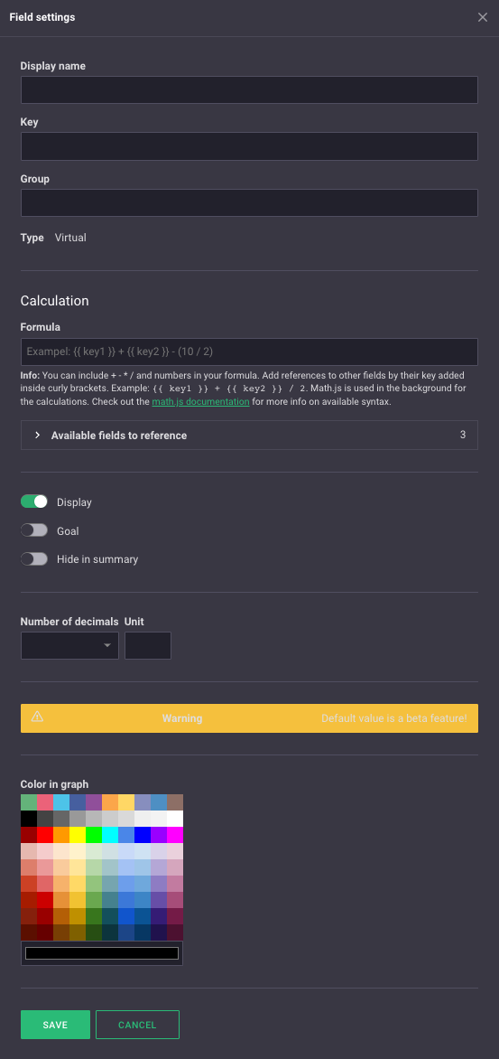
For the settings that are also available for a regular field, the same rules/information apply.
- In the "Formula" field, you enter the formula through which the virtual field will derive its value. Rules for the formula are provided beneath the field. You can also click on the link in the info text for further documentation.
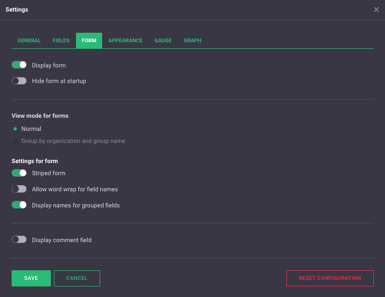
Forms
It's in the form that you input values for a field. In this menu, you will find the settings for the form in the data component.
- If you check "Display form," the form will be visible in the component.
- If you check "Hide form at startup," the form will be hidden until you click on it.
- Under "View mode for forms," you can (if the data component aggregates data from multiple organizations) choose whether values should be displayed per organization or aggregated according to the aggregation function set under each field's settings.
- If you check "Striped form," every other field in the form will have a different color.
- If you check "Allow line word wrap for field names," long field names will be displayed on multiple lines.
- If you check "Display names for grouped fields," the field name will be displayed for fields that belong to the same group.
- If you check "Display comment field," there will be a comment field at the bottom of the form.
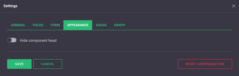
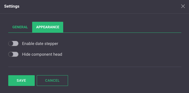
Appearance
Here, you can choose whether the component header (component name and date navigation) should be visible. If you choose to hide the component header, it will only appear when the user hovers at the top of the component.
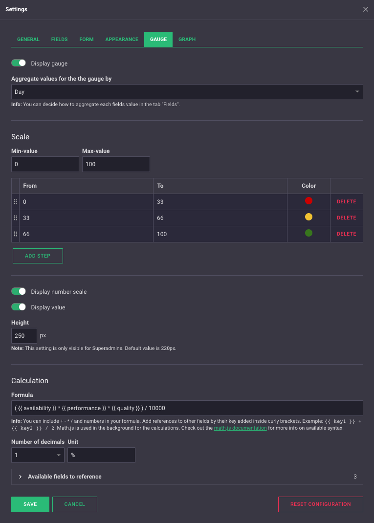
Gauge
The gauge is, apart from the form, one of two ways to visualize data in the data component.
- If you check "Display gauge," the gauge will be shown in the data component.
- In the "Aggregate values for the gauge by" field, you can choose whether the gauge should combine data for a week/month/year/etc. The data will be aggregated according to the "Aggregation function" set in each field's settings.
- Under "Scale -> Min/Max value," you select the range that the gauge should have, i.e., the lowest and highest numbers on the gauge.
- Under Min & Max value, you choose between which values the gauge should have each color. Clicking on the color allows you to change it. You can also add more color intervals.
- If you check "Display number scale," the scale will be visible on the gauge.
- If you check "Display value," the value of the gauge will be shown in the center.
- In the "Formula" field, you enter the formula through which the gauge will derive its value. Rules for the formula are provided beneath the field. You can also click on the link in the info text for further documentation.
- In the "Decimal places" field, you can choose how many decimal places should be displayed on the gauge.
- In the "Unit" field, you can choose what unit the value should have on the gauge.
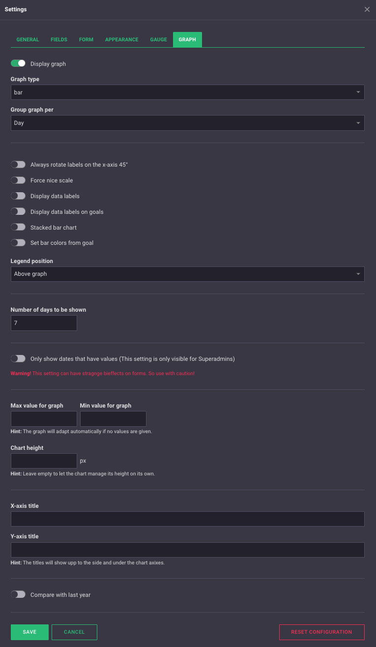
Graph
The graph is the second way to visualize data in the data component.
- If you check "Display graph," the graph will be shown in the data component.
- In the "Graph type" field, you can choose the type of graph you want to display.
- In the "Group graph per" field, you can choose whether the graph should group data for a week/month/year/etc. The data will then be grouped according to the "Aggregation function" set in each field's settings.
- If you check "Always rotate labels on the x-axis 45°," the labels showing the date of the bar will be rotated by 45 degrees.
- If you check "Force nice scale," the scale will be smoothed out.
- If you check "Display data labels," the value of each data point will be displayed on the graph. This does not apply to fields marked as "target" in the field's settings.
- If you check "Display data labels on goals," the value of the fields marked as "goal" for each data point will be displayed on the graph.
- If you check "Stacked bar chart" while the "Graph type" is set to "bar," the bars will stack on top of each other. This does not apply to fields marked as "target" in the field's settings.
- In the "Legend position" field, you choose whether the legend indicating which bar/line represents which field should be below or above the graph.
- In the "Number of days to be shown" field, you can choose how many days the graph should display. If the data source precision is set to week/month, you will be able to choose how many weeks/months should be displayed.
- In the "Max/min value for graph" fields, you can choose the range that the graph should display. If both fields are left empty, the interval will adapt to the values of the fields.
- In the "Chart height" field, you can choose how tall the graph should be.
- In the "Title for X/Y-axis" fields, you can choose a title for each axis.
- If you check "Compare with last year," a line with the values of the fields on the same date of the previous year will be displayed on the graph.
Number visualizer
In the number visualization component, you can visualize multiple key figures simultaneously. In the component's settings, there are two tabs.
General
Here you'll find the "general settings" for the component.
- In the "Name" field, you can choose what should appear at the top of the component in the overview view.
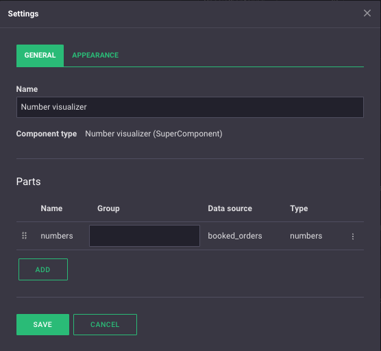
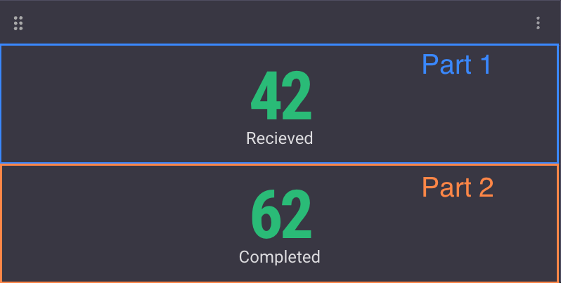
The Number visualizer consists of several parts. One part corresponds to a row in the component. Each part can be linked to its own data source.
To add a new part, click on "Add". You will then be shown the following menu.
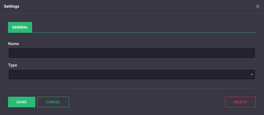
In the "Name" field, you can choose a name for the part. The name is not visible from the overview view but can make it easier to remember what each part does.
In the "Type" field, there are three options:
- If you choose "Header," you'll get an additional tab in the settings called "Header" (see image below). In the "Text" field, you choose what should be in your header, and under "Alignment," you select the position of the header.

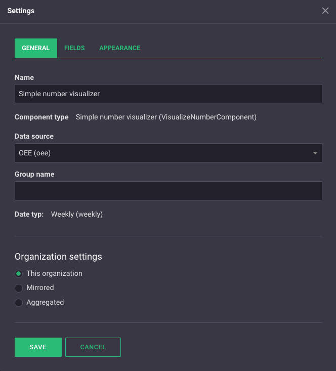
- If you choose "Number" as the type, the "General" tab changes slightly (see image below). In the "Data Source" field, you choose which data source's values you want to display in your number visualization. In the "Group Name" field, you can select a group name for your component. Under "Organization Settings," you can choose whether the component should mirror/aggregate data from other organizations. For more information about group names and organization settings, you can scroll up to the information about the data component. You'll also notice that the settings have a new tab, "Fields." Here, you configure how the data should be visualized in the component. The information for the "Fields" tab in the section about the data component also applies here.
-
If you choose "Increment" as the type, the "General" tab will look the same as it does for the "Number" type. However, the settings have gained a new tab, "Increment" (see image below). A tab of the "Increment" type allows you to change a field's value with predefined increments through plus/minus buttons.
In the "Field" box, you choose which of the data source's fields should change its value through the buttons. In the "Label" box, you can give the buttons a name. In the "Value" tab, you select how large the increment/decrement should be with each button press. If you check the "Allow negative values" button, you can decrease the value of the field below zero. If you check the "Display number form on button press" button, a form will appear when a user clicks one of the buttons.

Appearance
Under the "Appearance" tab, there are two buttons that adjust the appearance of the component.
- If you check "Display date stepper" a user can scroll back and forth in time at the top of the component.
- If you check "Hide component header," the component's name and date navigator will be hidden until a user hovers at the top of the component with the mouse.
Simple Number Visualizer
The "Simple Number Visualizer" component can be used if you want to visualize a key figure. In the component's settings, there are three tabs.
General
Here, you'll find the "General settings" for the component.
- In the "Name" box, you can choose what should appear at the top of the component in the overview view.
- In the "Data Source" box, you select which data source you want to link to the component.
- In the "Group Name" box, you can assign a group name to the component.
- Under "Organization Settings," you can choose whether the component should mirror/aggregate data from another organization.
For the settings "Group Name" and "Organization Settings," the same rules apply as for the data component.
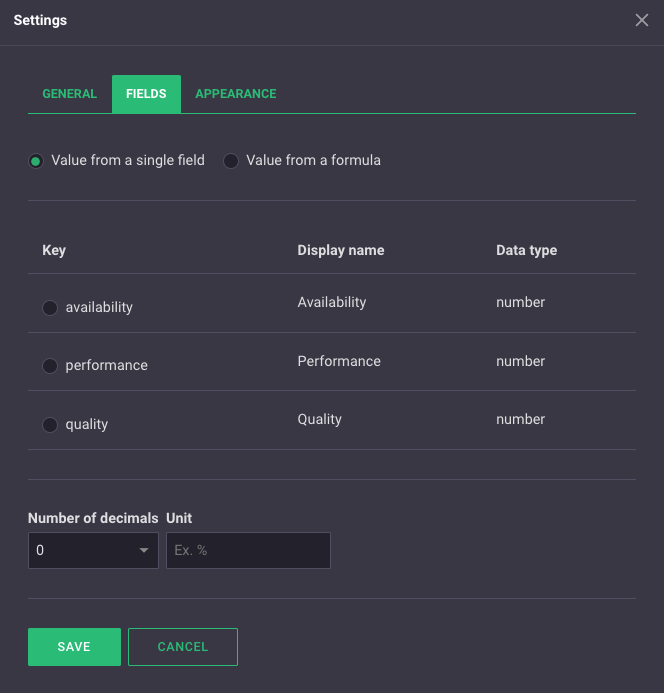
Fields
In this tab, you select which field in your data source you want to display.
- In the top buttons, you can choose whether you only want to display a field from the data source or a new value through a formula of one or more fields. The rules for the formula are the same as for the formulas in the speedometer/virtual fields.
- You then choose which field you want to display by selecting it.
- In the boxes at the bottom, you can choose how many decimal places the number displayed in the component should have, as well as which unit should be displayed.
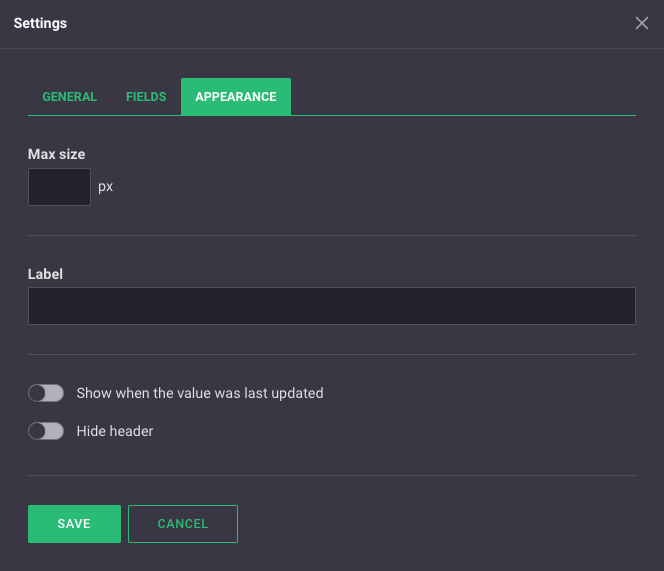
Appearance
Here, you can adjust the appearance of the component.
- In the "Max size" box, you can choose how large the number in the component should be.
- In the "Label" box, you can write a label for the number. What you write here will be displayed below the number in the component.
- If you check "Show when the value was last updated," a timestamp for when the value was last updated will be displayed beneath the number.
- If you check "Hide component header," the component's name will be hidden until a user hovers at the top of the component with the mouse.


