Digital dashboards that help you identify deviations and make the right decisions.
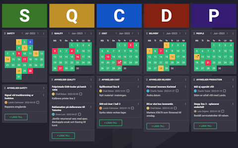
Improve key performance indicators within your specific focus areas with our SQCDP board.
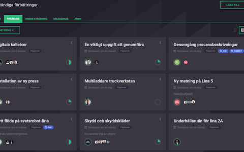
Continuous improvement, Kaizen boards, PDCA and other tools.
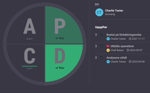
Use the PDCA cycle as a tool to improve both quality and processes
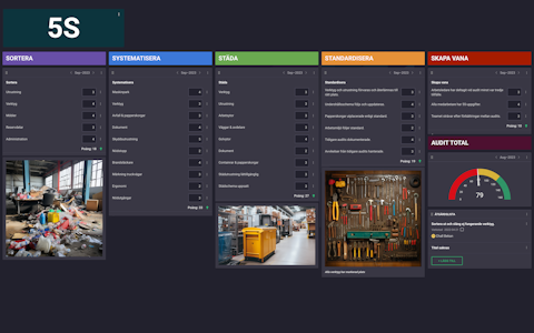
Digital tools for 5S work, recurring audits, and a well-organized workplace.
Visualize KPIs and communicate effectively throughout the entire organization.
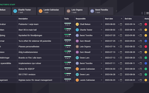
Basic project management and activity boards.
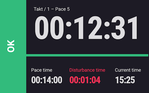
Digital dashboards for takt time flow with takt time counter and stop time log.
Digital visitor registration provides full control over all planned and executed visits to your business.
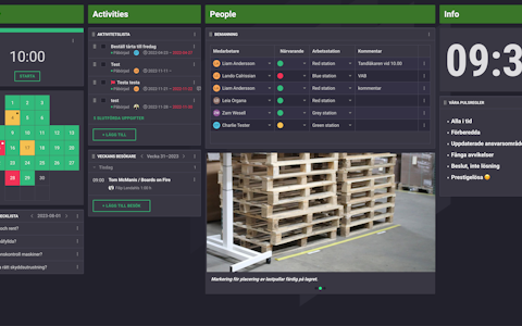
How are we doing in relation to the plan? Do we keep the production pace? And above all - does everyone know their current status? Boards on Fire helps you visualize key figures to everyone who needs the information.
The right information to the right people at the right time is a crucial success factor in most businesses. Despite this, many organizations struggle to visualize relevant key figures to all employees who benefit from them in their daily work.
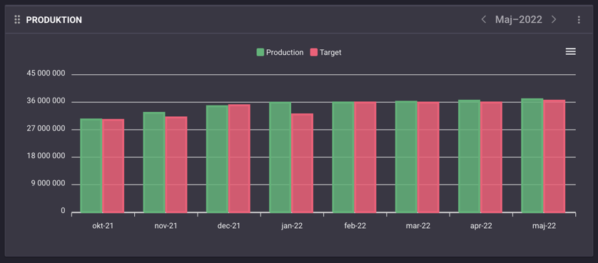
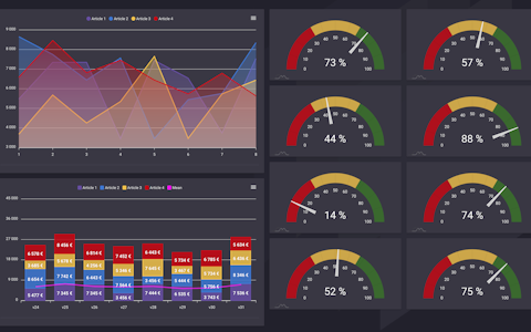
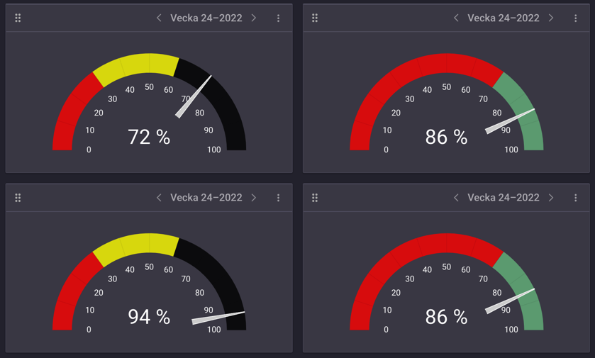
In Boards on Fire, there are lots of different options to present your data in a way that makes it easy to get a quick and clear overview. Graphs, tables, charts, number visualizations and speedometers that you can customize according to how you want to present the KPIs.
Management can have a dashboard that shows KPIs from across the company. Units, departments and groups can have separate boards that show their particular part of the business in more detail. The information can be escalated and aggregated up in the hierarchy or mirrored and shared between different departments.
Retrieve data from other sources automatically by integrating Boards on Fire with, for example, production systems or business systems. With information updated in real time, Boards on Fire helps you make the right decision to handle deviations continuously during the day.
Free web demo